
If you are embarking on a B2B marketing campaign, you could have (understandably) felt daunted by the prospect. As the research firm Gartner indicates, when B2B buyers are trying to figure out what to buy, they spend just 17% of this time meeting with potential suppliers.
As a separate 27% of this time is taken up by research undertaken independently online, your B2B landing webpage could face tough competition for attention. Nonetheless, optimising that page doesn’t have to be arduous — at least if you follow these steps…
Don’t pressure visitors simply to buy
Gartner notes that six to 10 decision makers are involved in the typical buying group for a complex B2B solution. Given how long it can take for a group like this to reach a consensus about a purchasing decision, your landing page could be built to help with the research stage.
So, the call-to-action on this page could urge the visitor to register for a free consultation or watch an online presentation, like a webcast, you have carefully prepared in advance.
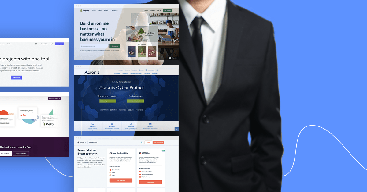
Give the page one purpose above all
Practical Ecommerce explains: “The goal for your landing page should influence its messaging, design, and call-to-action.” Basically, you don’t want to attempt too many different goals with your landing page, lest users be confused about what exactly it is meant to be about.
This is why you should make the page’s purpose so clear that it is beyond interpretation — and leave a clear path for the user to take if they decide to act on your message.
Get straight to the point with the headline
As this particular part of the page is supposed to persuade visitors to scroll down it, the headline should be displayed both clearly and prominently. That can mean opting for large, chunky letters and bold colours, all of which placed in the centre of the page.
However, the headline also needs to be concise. One good test is whether first-time readers of this headline would be able to understand it within just a couple of seconds.
Keep the page’s layout simple
B2B buyers might spend a lot of time on research, but that doesn’t necessarily mean that they will be naturally inclined to linger on your landing page for particularly long. These buyers tend to consider multiple suppliers, and so will want quick explanations and answers from each.
Your page should therefore be designed to facilitate speedy perusal. Stick to the essentials of a headline, visuals, copy, a call-to-action, and a lead form.
Make the text ‘scannable’
In other words, make the text easy for visitors to digest from a glance. You could find that breaking much of the required information down into bullet points helps you with this.
Including certain common phrases, like ‘how to’, in the copy could also help readers to quickly discern what the page is about.
Research has demonstrated how making text more readable works for optimising B2B landing pages, as scannable formats have been found to boost usability by 47%.